
When you reach a point in your project where CSS changes become something nobody dares to do, it might be the right time for some refactoring to gain maintainability.
Getting rid of those (random and way too many) !important’s and selectors from hell (.header.in-footer h2 a .actually_sidebar .link.red.final span) what I like to call them instead of adding more of them to circumnavigate possible side-effects.
Maintaining legacy CSS is no fun, time-consuming, and error-prone. Even less funny is doing major frontend-refactorings when you never can be sure what you might destroy on the way without directly recognizing.
Veraltete Software ist oft Nährboden für eine Schatten-IT, die Zeit, Qualität und Innovationen kostet.
- Beschleunigung der Prozesse – damit werden Preis- und Sortimentsanpassungen in wenigen Minuten anstelle von 30 – 50 Minuten pro Updatelauf durchgeführt.
- Höhere Datenqualität & bessere Governance durch integrierte Validierungsregeln und Plausibilitätsprüfungen.
- Entlastung und bessere Usability für Fachabteilungen – ein wichtiger Schritt gegen Schatten-IT, da fachliche Zusammenhänge sichtbar werden und aufwändige Excel-Analysen entfallen.
Individualsoftware für digitale Herausforderungen
But how can you approach a CSS refactoring? Try SMACSS!
SMACSS stands for Scalable Modular Architecture for CSS, and it is a „style guide“ for structuring CSS (by Jonathan Snook).
It is intendedly not called a framework. There are no rules you need to follow, and SMACSS does not contain a single line of code. For me, SMACSS is a way of thinking for writing and structuring CSS.
Let’s dive into it!
SMACSS proposes organizing CSS rules into five suggested categories: base, layout, module, theme, and changing state. I only use the first three categories because I think that theme and changing state add more complexity than they can reduce. If you want to find out more about the three categories, please go to Jonathan’s website.
base
The base category contains all the style definitions responsible for a coherent and consistent look of the page. Like colors, fonts, font-sizes, etc. For the same reason, all direct style definitions of HTML elements (like e. g. form elements, links, and buttons) reside here.
colors.css
body { background-color: #fff; color: #333; }
.inverted { color: #fff; }
.error { color #f00; }
.highlight-primary { color: #ffff00; }
.highlight-primary-inverted { color: #00ffff; }
Kurze Unterbechung
Das ist dein Alltag?
Keine Sorge – Hilfe ist nah! Melde Dich unverbindlich bei uns und wir schauen uns gemeinsam an, ob und wie wir Dich unterstützen können.
forms.css
label { font-weight: bold; }
input[type="text"] { border-color: #333; padding: 0.25em 0.5em; }
input[type="text"]:hover { border-color: #888; padding: 0.25em 0.5em; }
layout
The layout category contains everything related to the architecture of your page layout. These relations involve stuff like header-section, sidebar-section, main-content-section, and so on. Especially responsive page behavior and/or „classic“ floating and flexbox page layout rules belong in this category.
For me, having one file that holds all the layout related rules is the way to go. In my experience, this file stays neat even if you do fine-grained responsive site-behavior. I also used ids as selectors for the layout rules (and only for the layout rules). Layout rules are not meant to be used more than once, and they should be changeable without any worries about side-effects.
layout.css
#page-wrapper { display: flex; align-items: flex-start; flex-direction: column; width: 100%; }
#header {  display: flex; width: 100%; }
#content-wrapper { display: flex; align-items: stretch; flex-direction: row; width: 100%; }
modules
The third category is modules – and it’s basically everything else, from your header’s details to defining a sophisticated accordion. Everything is a module. You also can think of modules as components (what might make it easier in contexts of modern JavaScript frontend frameworks).
Each module you write is a new CSS file. For example, a keyvisual.css, accordion.css, login.css, etc. The filename is the prefix for every selector in this file. Sticking to these two concepts (one file per module, the filename as selector-prefix) helps you regarding maintainability and refactorings:
- you always know in which file you have to look for a style-definition
- you can be sure that there are no side-effects because the classes/selectors are used only within the module
- if the module isn’t used on your website anymore, you can drop the related CSS file, which helps to avoid dead CSS rules
keyvisual.css
.keyvisual-wrapper {…}
.keyvisual-images-wrapper {…}
.keyvisual-image-item {…}
.keyvisual-image-headline {…}
Pack it together
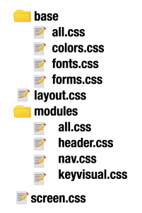
Now that you have your CSS separated into three categories (base, layout, and modules) and multiple files, you have to combine everything and include it into your website. SMACSS suggests using import-statements for doing so: you create an all.css file where you include all regarding category files for each category. The category-all-files themselves get imported by one top-level CSS-file (screen.css in the example below). This screen.css is the CSS-file that you include on the website.
Your file-tree might look something like this:
Following this method adding CSS to your website is still very easy: you have to include one file. With HTTP2, you don’t even have to worry about the number of files included / number of HTTP-requests. With HTTP2, parallel requests to the server won’t block each other any longer what means that you don’t have to expect extra time while loading and building the page if the CSS is split into multiple files. With HTTP1, this was a problem. Or maybe you already have a CSS preprocessor or bundler in your project that can resolve those imports.
With which part should you start?
It might be a good idea to make use of SMACSS right from the beginning of your project. But if you are already faced with maintaining legacy CSS, you may ask yourself by now: what is the best starting point for restructuring your CSS. As always: it depends.
If you have tons of color definitions, it might be an excellent start to collect all colors and unify equal or alike colors for future usage. If the page layout is particularly easy/tricky on your project, this might be your starting point. Or you grab a module that you feel comfortable with for a start.
Do what feels best. You basically can’t do anything wrong. And anyway, you will have to go through some painful refactorings along the way of replacing the old legacy CSS monster with your new renamed and structures rules.
I would recommend doing restructuring as a process alongside the standard development process rather than going for a big bang. There is no need to do it all at once. And if you do it all at once, chances are pretty high that you forget or break something. You can and should move slowly and with caution here – no need to hurry.
Give it a try! There is no rocket science involved. It is straightforward, and you can only win.
SMACSS – or are there alternatives?
It does not have to be SMACSS what you use to clean up and restructure your CSS. There is also BEM (http://getbem.com/) and a lot of other paths you can follow. Which I would be very interested in! If you have something you can share, please drop it in the comments.
SMACSS was included in many projects that I worked on, so I choose it for this post. I have only good experience using it, and it worked for me as it did for the projects and teams involved.
Use a CSS preprocessor.
I already mentioned CSS preprocessors above in the „pack it together“ section, and I recommend using them for writing better structured, neater, and better maintainable CSS.
A preprocessor like SASS or LESS will help you write less duplicate code by providing variables and mixins. Variables enable you to define colors, font-sizes, font-families, you-name-it in one place, and then use the variable instead of repeating a hex-code or a font-name over and over again. Mixins do pretty much the same with the difference that you don’t only define a single value but a combination of attributes and values that are often used together.
If you aren’t using a CSS preprocessor in your project by now, you should think about adding one when you start refactoring.

Schreibe einen Kommentar